Update
Please note: This is an updated post - I initially combined two separate topics into here, one on understanding the Viva Connections app package, and another on a custom way to generate it. I've split the second topic into it's own post: A Different Way to Create the Microsoft Viva Connections App Package.
Background
If you're just tuning in now, this post is one in a series I'm working on on better understanding and customizing the Connections app in the Microsoft 'Viva' family of 'Employee Experience' apps for Teams (if you're not familiar with Viva Connections, here's a short overview video from Microsoft).
Prerequisites
As part of Microsoft's guide to setting up Viva Connections, they list a few optional-but-highly-recommended "pre" steps to getting Viva Connections up and running. Basically, Viva Connections is about embedding a SharePoint Modern Communications site into a custom side-loaded app into Teams. As a result, you need to actually have a SharePoint site to embed. In addition, because this Viva Connections app is likely going to be rolled out to your entire company, it makes sense to set up and use a site that is configured as a Home Site.
Also, because there's some special sauce to how Connections opens up the menu (see this video for a demo of that - I've deep linked directly to that time in the video), it makes sense to enable Global Navigation as well.
In the examples in this post, let's pretend that my SharePoint domain is 'https://MyTenant.sharepoint.com/', so this is what I would configure when setting up Viva Connections.
Building Viva Connections
In the setup guide I linked above, once the pre-requisites are complete, the next step is to download and run a PowerShell script to create the actual Viva Connections app package. Now, this app package is very similar to one you might create yourself using App Studio or Visual Studio, such as is described here. However, there is one very important difference - let's explore the package contents and see later on what it is.
The package itself is just a zip file, so you can open it up and you'll see inside 3 files:
- A
manifest.json- this is a file structured using the "JSON" notation (a way to define a document that's computer-readable but also human-understandable) - A larger icon to appear in certain context menus in Teams
- A smaller icon to appear in the left menu so users can actually access "Viva Connection" (or whatever you choose to call your own internal version of it)
With regards the icons, the article linked a moment ago discusses them, but to be frank it's not really clear what's what, and to make matters worse, the article is generalised to all Teams development, not just for Viva Connections (for instance it mentions how the icons might appear i a Message Extension, which is NOT what your're building here). So, to help make things clearer, let's see some screenshots.
Icons in Action
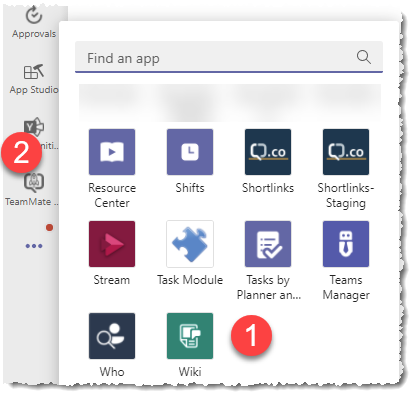
Unfortunatly, the icons are really poorly named - it's hard to understand which one is getting used where, and that's aside from the fact that the "Color" one is mispelled (sorry ;>). It's even more confusing because even in basically the same place in Teams, the different icon variants can appear. Here's a sample screenshot to illustrate this:

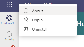
In the screenshot above, you're basically seeing both types of icons appearing. If your app is NOT currently active in the left siderail, then clicking the lacuna ("...") menu item at the bottom of the list opens the list of other available, installed apps. In this case, even though they're both basically the same list of your installed apps, you're seeing the "Color" icon (marked as "1") for some apps, and the "Outline" icons (marked as "2") for some apps (you can even see some of my apps appearing in there, like Shortlinks in the "Color" icon section and TeamMate in the left rail near the bottom). This basically shows one place where both icons can potentially be used. For Viva Connections, you might be thinking that the user would only ever see the smaller "Outline" icon, particularly if you have a policy to pin it, say, on top of the menu, but there are still places the full "Color" icon can appear. For instance, if the user accesses the app's menu options (e.g. right-click on desktop) and chooses About, like below:

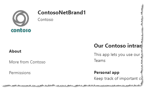
then they will see the "Color" icon once again, as shown below:

Finally, although Viva Connections is only available for Desktop right now, when Mobile support comes, this icon will also be prominent on devices for accessing Viva Connections from the Teams app, if this is how it finally arrives (maybe it will be an app on it's own? Who knows).
The "Outline" icon is a bit more simple because it really only appears in the left rail menu, but even then there are some important comments. When looking again at the details about the icons in the page I linked previously, in particular for the "Outline" icon it says:
It can be white with a transparent background or transparent with a white background (no other colors are permitted)
Now, this is certainly important if you are submitting apps to the Teams store, but for internal apps you don't really need to follow this rule. It's generally good guidance so that the left rail appears consistent, and works well across the different Themes in Teams (Light, Dark, High Contrast), but as an "fyi", if you want to you can break this rule to have your icon stand out more.
Other Bits in Action
So we've seen now where and how the icons are used, let's look at the other properties of your Viva Connections app and where and how they appear. When you run the PowerShell script, for instance, there are parameters like Short Description and Long Description, so where are these used.
In short, these go in to the final package in the manifest.json file, and here is a sample Viva Connections app manifest showing the final file.
Inside there are:
- Sections about the company itself, like this:
"developer": {
    "name": "Contoso",
    "websiteUrl": "https://www.contoso.com",
    "privacyUrl": "https://privacy.microsoft.com/en-us/privacystatement",
    "termsOfUseUrl": "https://go.microsoft.com/fwlink/?linkid=2039674"
  },
So this is where the company name and website will appear, as well as any custom Privacy Policy and Terms of Use you might have supplied (these last two, if left blank, will default to showing Microsoft ones).
There are also things like:
-
App Details
"name": {
"short": "ContosoNet",
"full": "ContosoNet"
},
"description": {
"short": "Our Contoso intranet inside of Microsoft Teams",
"full": "This app lets you use our Contoso intranet, ContosoNet, directly here inside of Microsoft Teams"
},
as well as:
- Viva-Connections-specific settings (i.e. things about the page itself that will be embedded), like:
  "staticTabs": [
        {
            "entityId": "sharepointportal_b5e2b2e4-5102-4e80-8626-4532c63a3d39",
            "name": "ContosoNet",
            "contentUrl": "https://MyTenant.sharepoint.com/_layouts/15/teamslogon.aspx?spfx=true&dest=https://MyTenant.sharepoint.com/?app=portals",
            "websiteUrl": "https://MyTenant.sharepoint.com/",
            "searchUrl": "https://MyTenant.sharepoint.com/_layouts/15/search.aspx?q={searchQuery}",
            "scopes": ["personal"],
            "supportedPlatform" : ["desktop"]
        }
    ],
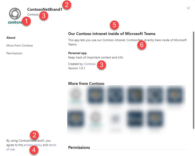
The screenshot below shows a lot of these in action, and we can see the main place these all appear is in the "About" page for the app.

To be clear on the numbers, these are:
- Color icon
- App Name
- Company Name
- Privacy Policy and Terms of Use links
- "Short" Description
- "Long" Description
Interestingly, notice also the "supportedPlatform" : ["desktop"] setting - recall that, at this time, Viva Connections is only available for Desktop, with Mobile coming later this year (2021). When this happens, we will likely be updating our manifest, either by hand or with an updated PowerShell script (note that the current script hard-codes the app package version to "1.0", and we would need this version number bumped to be able to install the updated version).
Anyway, that's a bit of a look at the Viva Connections app package. In future posts I'll look at some customizations you can make, and also different ways to generate and install the Viva Connections app altogether, if you're PowerShell-shy, so Stay Tuned.